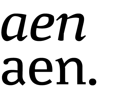
Minuscule Italics have been designed recently; they didnt form part of the starting project. The problem was to produce a highly contrasted italic, which wasnt narrower than Roman, because width is very important for the characters recognition. Italics design is very sharp and angular: its rythm is very different, which allows Italic to be still distinctive in very in small sizes. Different solutions were brought to the problems of reduction: some counters are completely opened, the curves break gradually to release inner white space, stems are strongly emphasized. There are many differences between the soft and contrasted Minuscule Six Italic and the sharp and strong Minuscule Trois Italic, even more than in Regular versions.