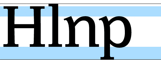
This point will not doubt have the biggest influence on legibility : « to reduce the prominence of long letters », as Javal wrote, means to increase the size as much, in its most significant parts. Yet the reduction of the ascenders and descenders must be done with care : the word outline is very important in the perception process, and the long letters have to be distinguished from the short ones.
Descenders could be a bit more shortened, and this without necessarily damaging legibility : we usually read the upper part of the letters, and descenders are less numerous than ascenders.
[ ]
In the Minuscule, ascenders and descenders have been shortened as much as possible. Descenders are shorter, and I had to cheat with some letters : for example, the p has a smaller x height (see the bowl upon the baseline), and the g loop has been cut away.